Onboarding
Boosting user engagement with an improved flow.
Homeis is a community-based app that connects immigrants with local resources and networks. The project focused on redesigning the onboarding process by addressing user pain points discovered during research, integrating custom illustrations, micro-animations, and refining the copy. The result was a more engaging and welcoming user experience that improved conversion rate.
Date:
2019
Role:
UX/ UI, illustration, micro-animation.
Team:


Problem statement
The onboarding process is crucial as it's the first interaction users have with the product. User feedback and data revealed that the current onboarding experience was lacking, leading to the need for a comprehensive redesign.
Goals
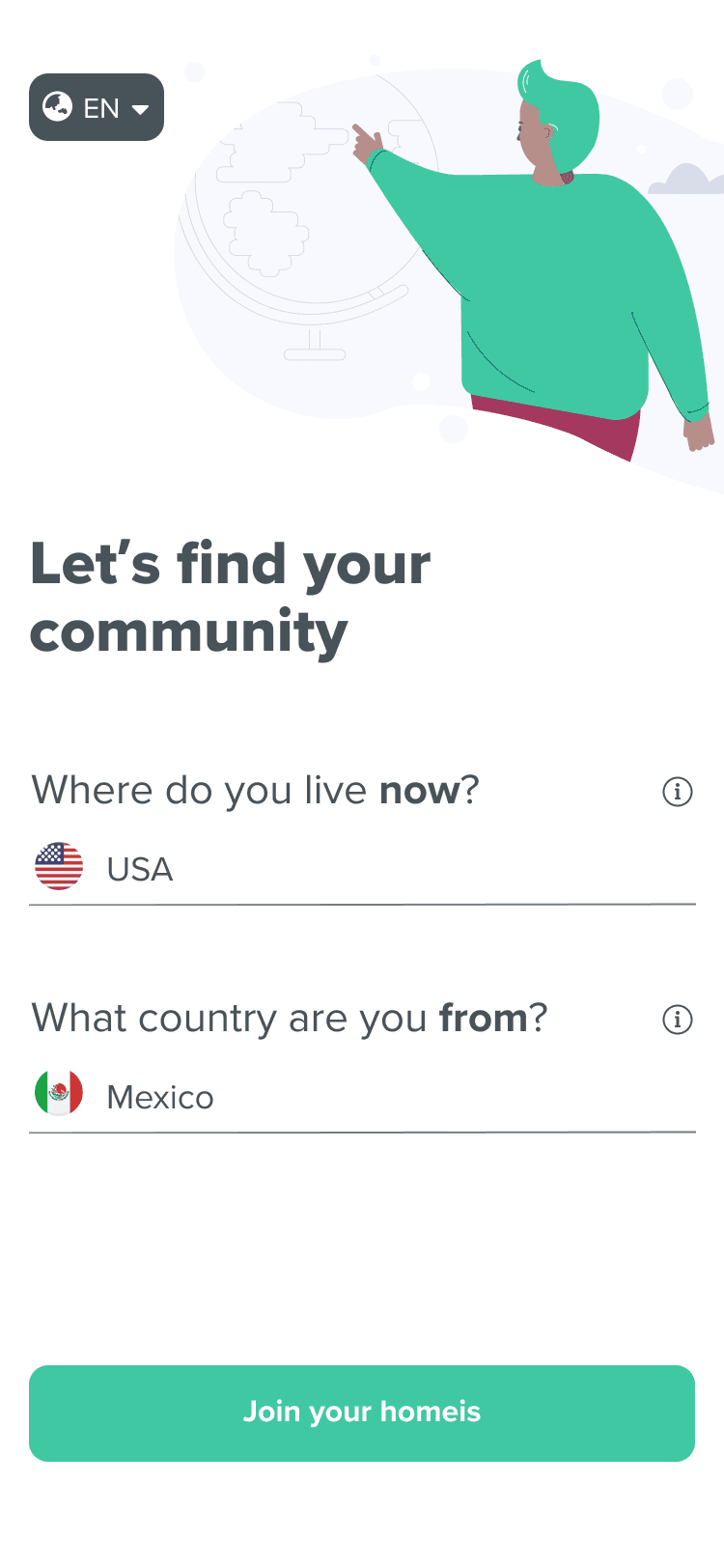
The main KPI is increasing sign-up conversion rate. The goals were: Address user concerns around privacy and cultural sensitivities, Highlight the app's benefits effectively and Build trust, particularly with immigrant users, to provide personal information safely.
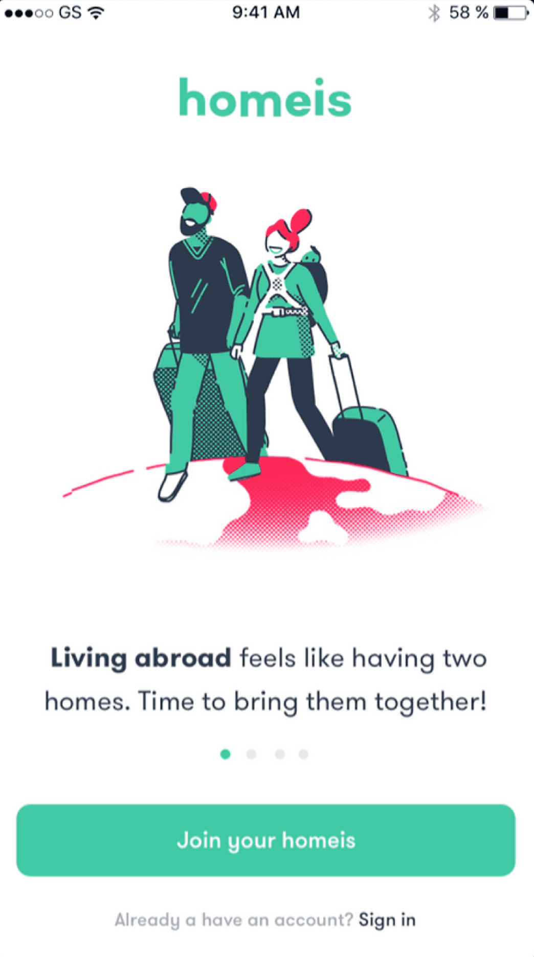
Old version
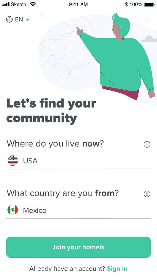
New version
Solution
Create a whole new onboarding experience highlighting app benefits, ensure privacy reassurance and make immigrant users feel safe sharing information so we can build trust, aiming to boost sign-ups and engagement right from the start.
research
We analyzed the existing onboarding data and identified significant drop-off points. To understand user concerns, especially among immigrant users, we conducted competitive analysis, reviewed user recordings, and gathered insights from hundreds of interviews and surveys. This helped us pinpoint cultural nuances and pain points that needed to be addressed.
Pain points
design decisions
Design principles
Explain the why
We ask only what’s necessary, and highlight the purpose and value of each step, building clarity and trust in the process.
Language support
Write micro-copy in 15 languages, ensuring users feel understood and supported in their preferred language.
Custom illustrations
I decided to focus on diverse illustrations and engaging animations, creating a welcoming and dynamic user journey.
Intro
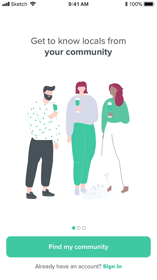
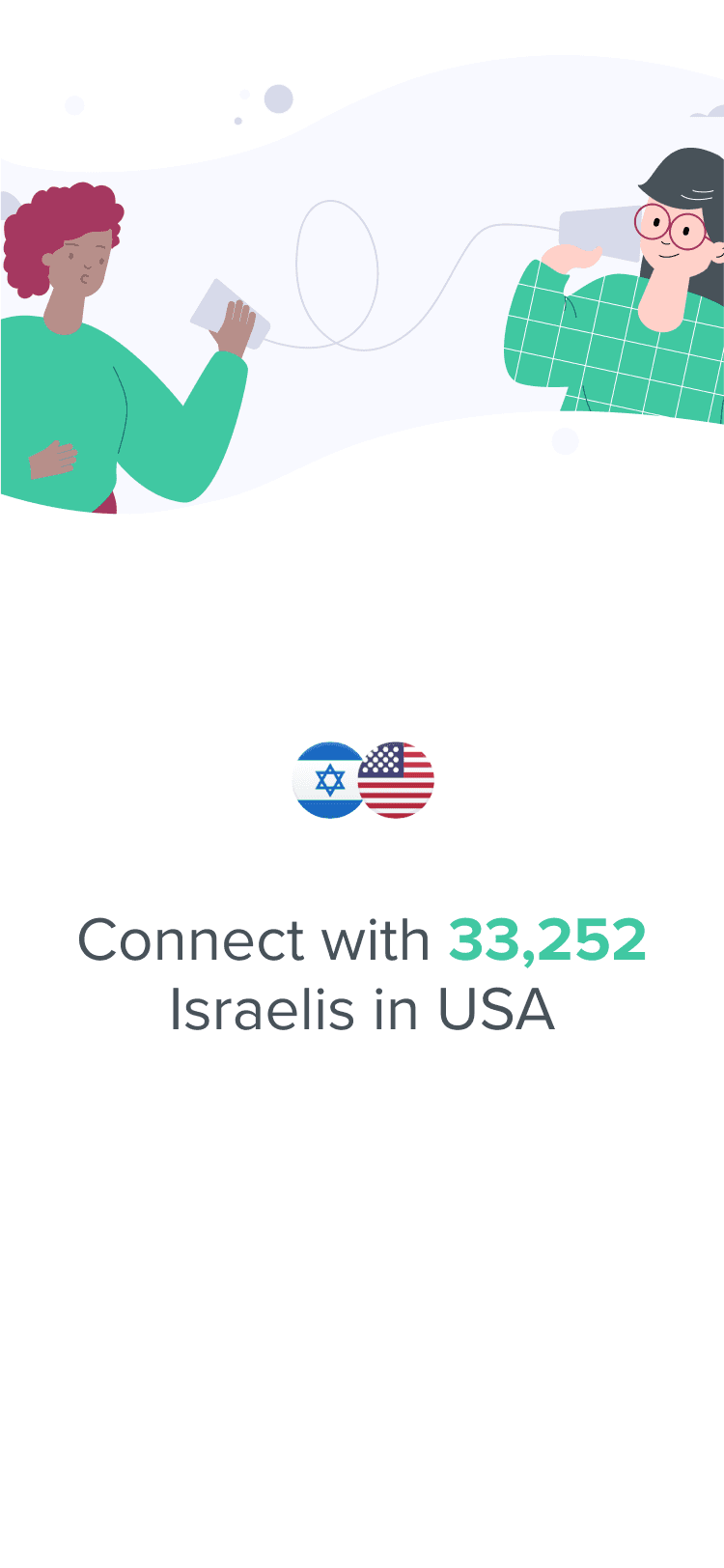
The previous intro was too long, so we condensed it into 3 main screens, following the rule of three, which is known for its effectiveness in creating content that's more memorable and engaging. We also added automatic transitions and playful Lottie animations to create a warm and welcoming feel.
Playful animated illustrations
Registration
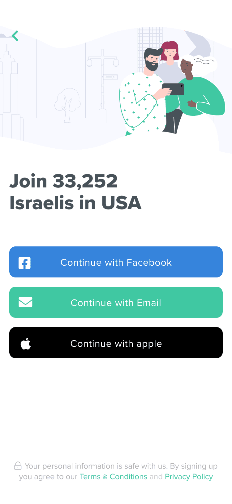
We enhanced the registration process by creating a sense of belonging with messaging like "Join 33,252 Israelis in the USA," added quick Apple ID sign-up for iOS, and emphasized data privacy with clear summaries of our policies.
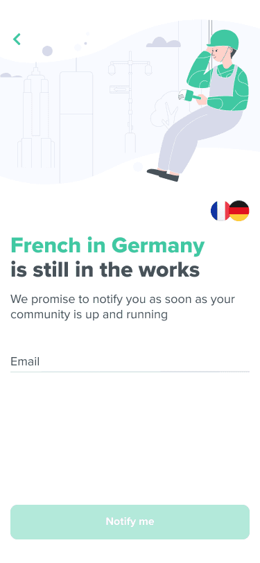
Edge cases
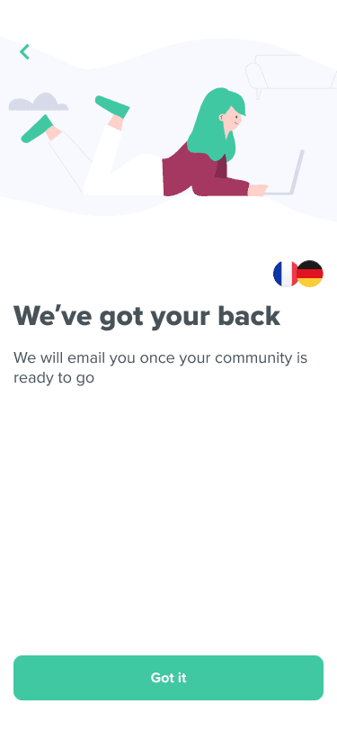
Here’s an example for one: a user is looking for his community but sometimes is just to specific and we don’t have an active community for that, but we wanted to give him the feeling we’re taking care of it.
Profile
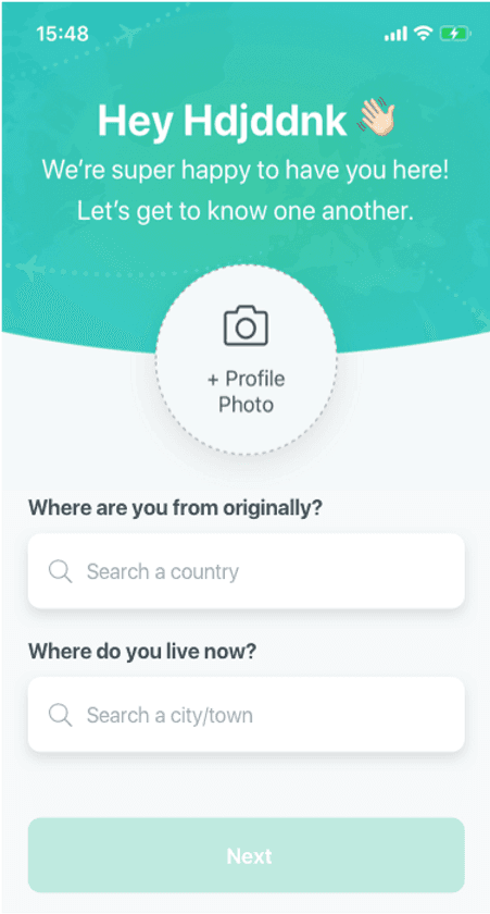
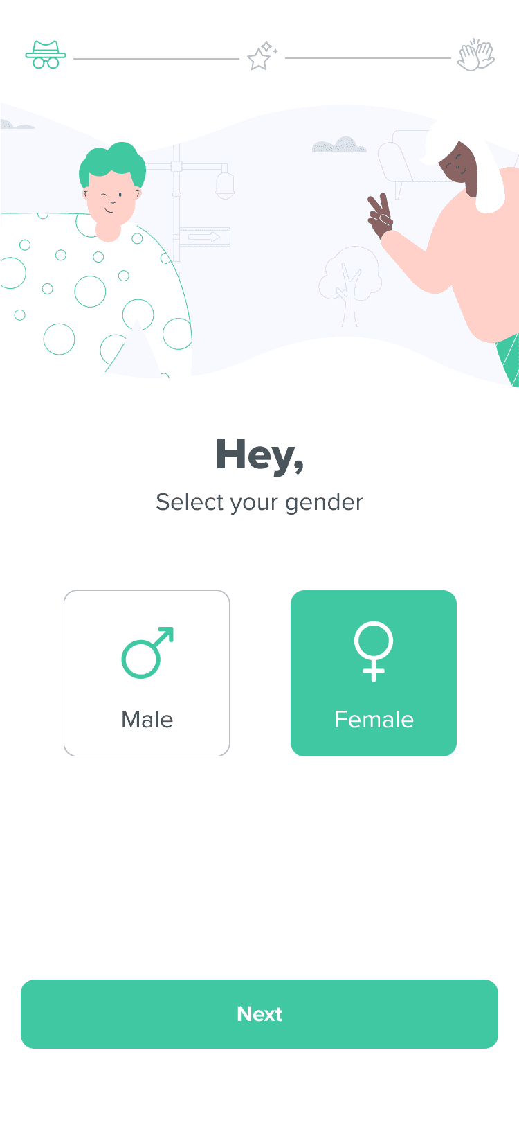
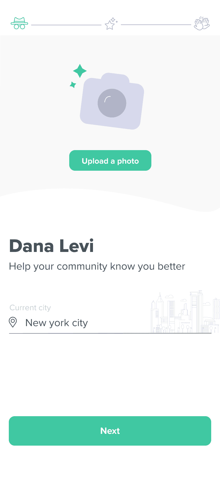
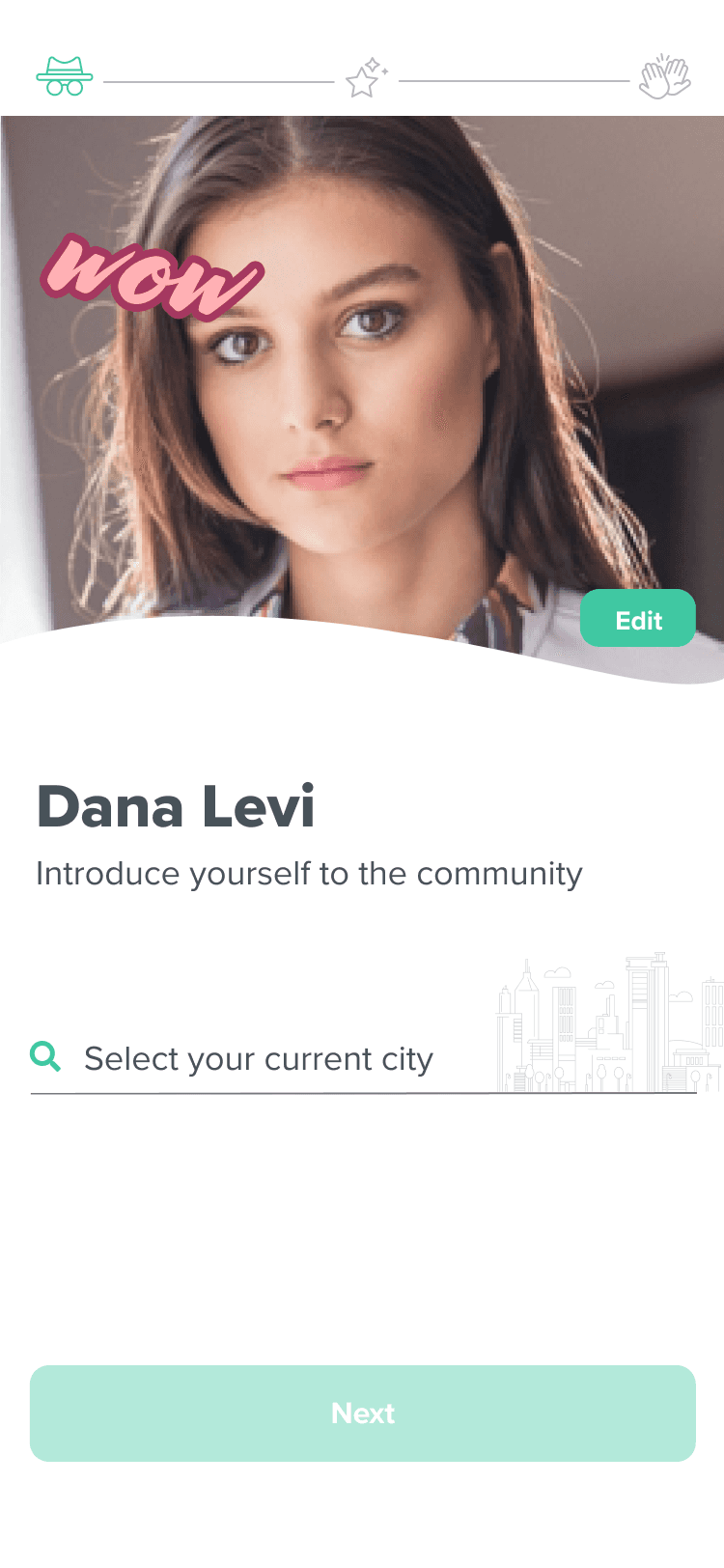
In the profile section, we added a progress bar to guide users and included an animation for the "upload picture" prompt, followed by a playful reaction like "Wow" upon upload. To personalize the experience, we displayed the ten most popular cities for each nationality first. Based on user feedback, we removed intrusive questions entirely to improve the user experience.
Details are everything
Enable notifications
The previous version wasn't satisfying enough so we changed the micro-copy and the illustration including a cute animation. We also emphasized the CTA which led to a significant improvement in confirmations.
Results
The conversion rate improved significantly, and users had a more positive experience with registration. We saw better engagement thanks to animations and custom illustrations, and custom dashboards helped us track and optimize the process.
+16%
sign-up ratio
+40%
overall conversion rate
+52%
photo upload

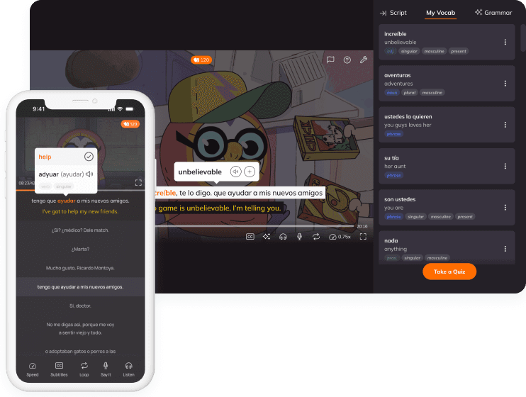
Watch and learn
Bridging passive watching and active learning to cut churn.
User research • Micro-animation

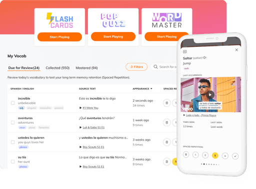
Smart word system
Optimizing vocabulary management with intuitive tools to boost engagement.
Complex system • Competitive analysis • User-centered design
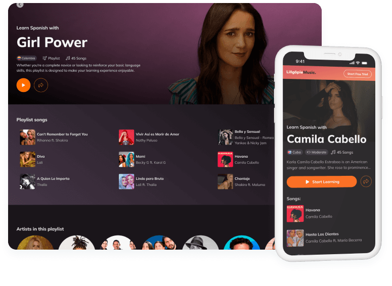
Lingopie Music
creating, rethinking, and integrating to drive growth.
Concept development • feature adoption

