Smart word system
Optimizing vocabulary practice with intuitive, organized tools to drive engagement.
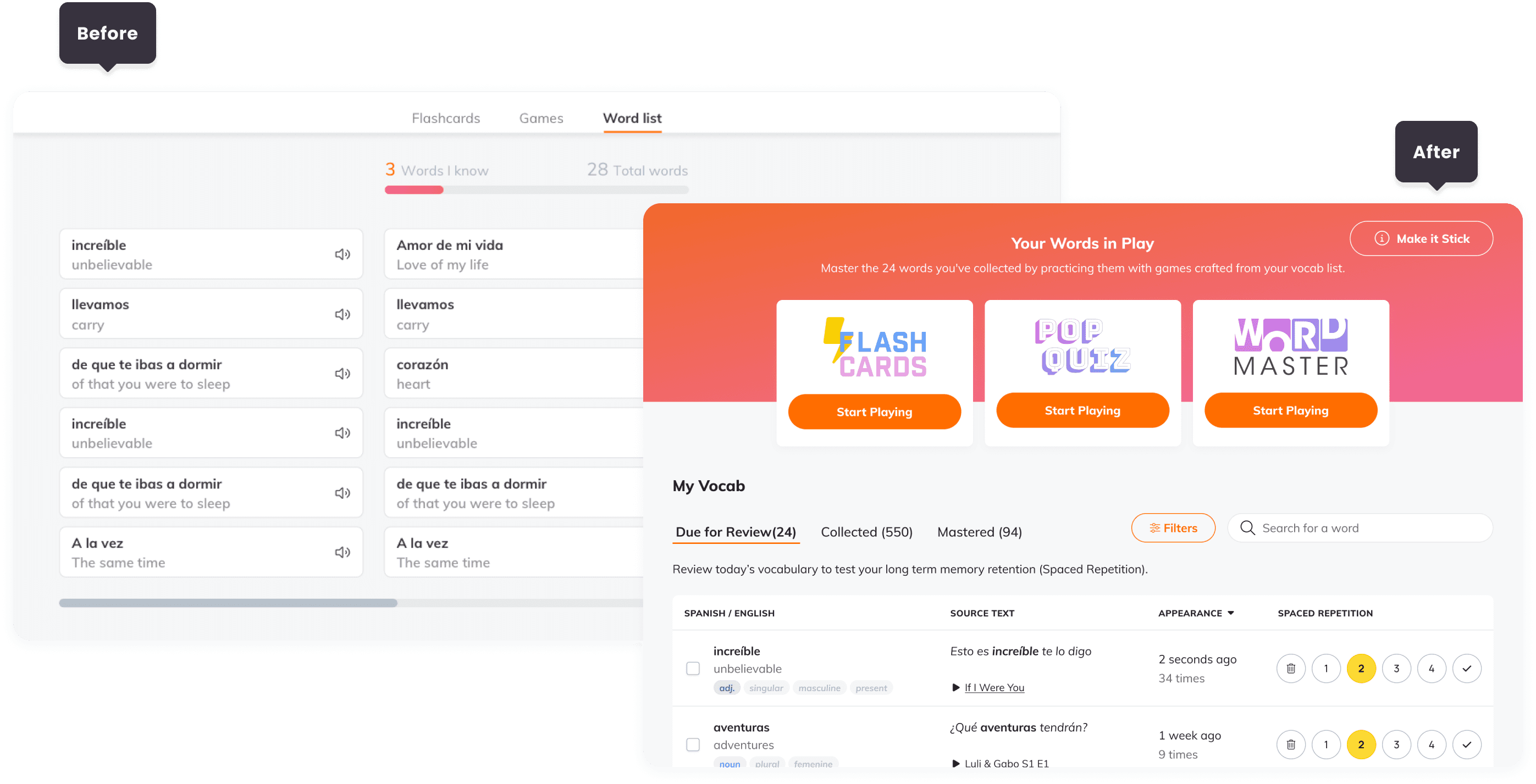
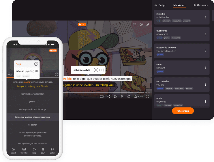
Lingopie, a language-learning platform, transformed its Word List into My Vocab, evolving a basic feature into a comprehensive learning tool. The redesign improved navigation, added detailed word insights, and enhanced usability, enabling learners to track progress and practice more effectively.
Date:
2024
Role:
Competitive analysis, UX/ UI, collaboration.
Team:


Problem statement
The word list on Lingopie lacks key features, limiting its effectiveness and user engagement. Competitors offer these features by default, making it crucial for Lingopie to meet user expectations.
Goals
Enhance user engagement and retention by improving word list navigation and organization, while encouraging consistent practice and progress tracking.

research
Our research involved collecting user feedback through surveys and interviews to identify key pain points considering many of them use multiple platforms besides Lingopie. Competitive analysis revealed best practices in vocabulary management and user engagement from similar platforms, providing valuable benchmarks for redesign and enhancements.
Pain points
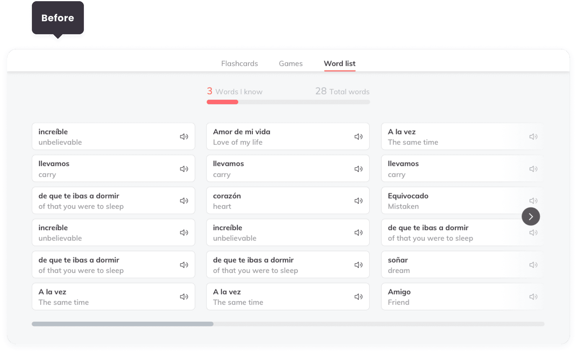
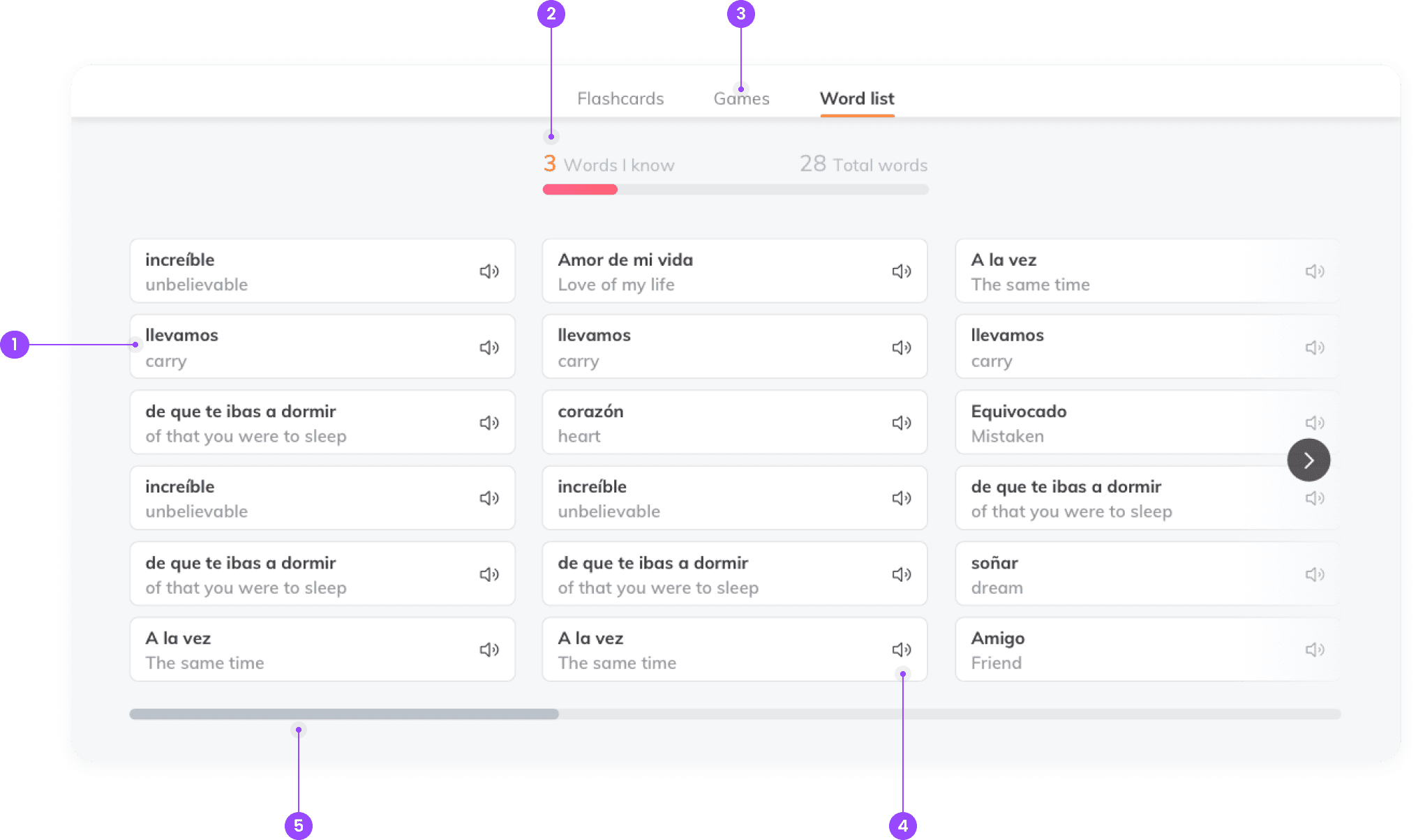
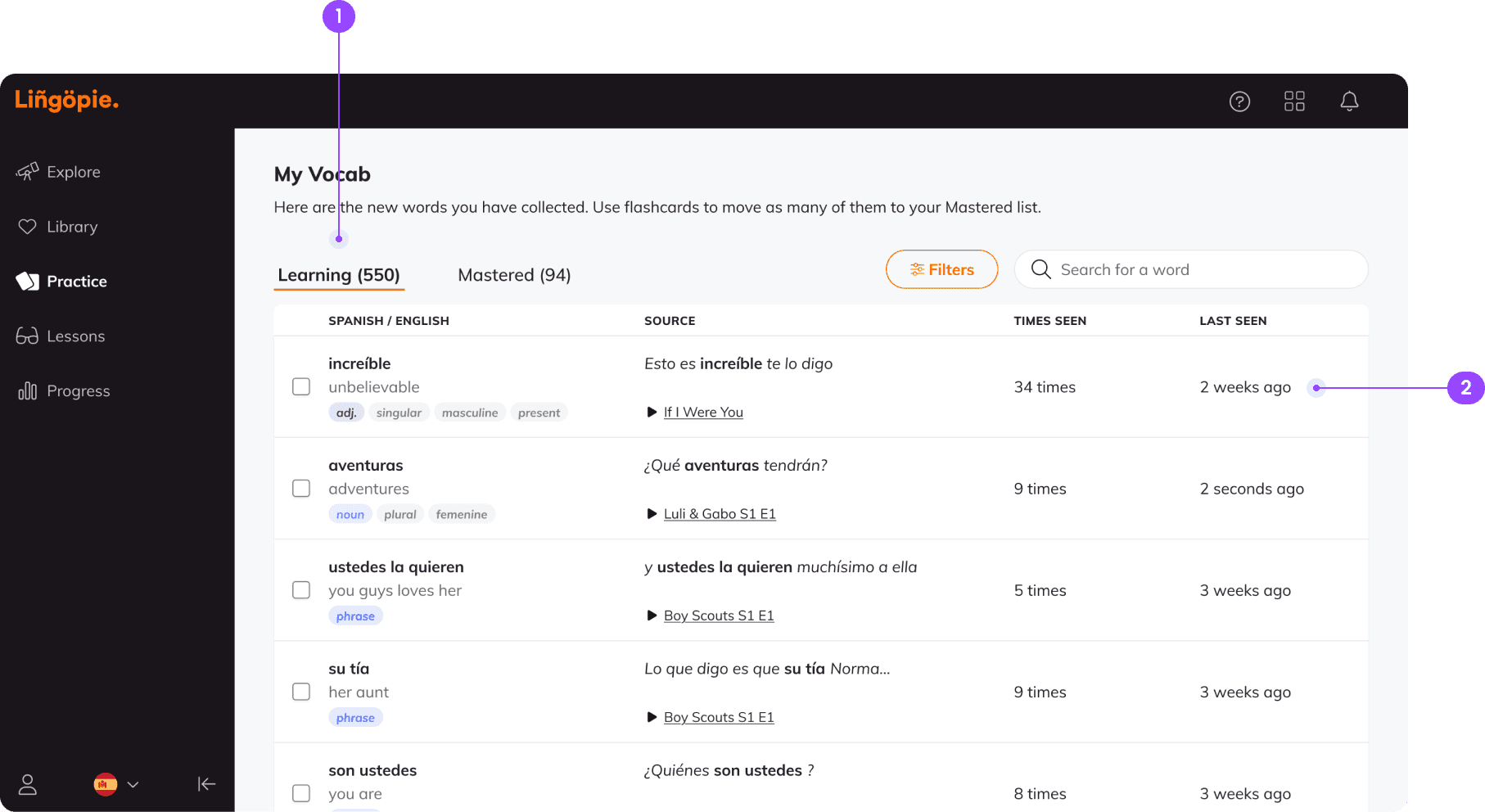
I reviewed the existing design and identified several issues: insufficient word information (1), difficulty accessing known words placed at the list's end (2), disconnected games (3), limited actions per word (4), and challenging horizontal navigation (5).
The old design.
Collaborations with the language and teachers teams helped integrate backend data into the design, including word frequency and contextual details. These efforts ensured the new features aligned with both user needs and technical capabilities, creating a strong foundation for the redesign.
design
Word box & table update
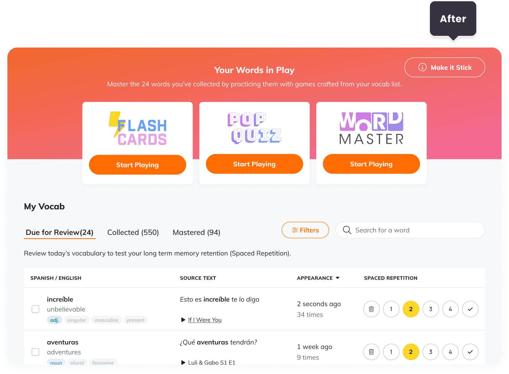
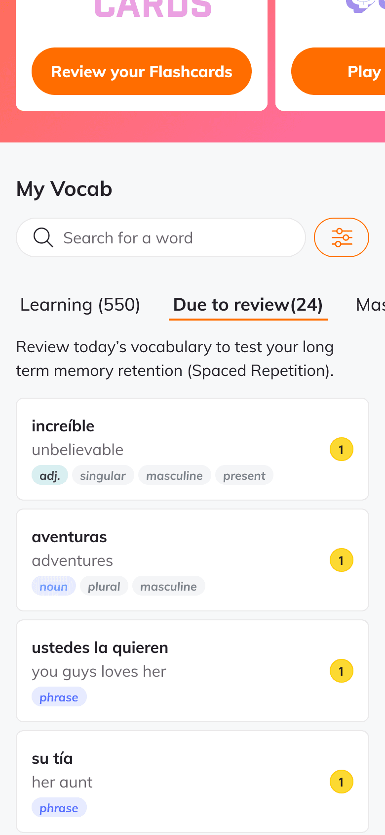
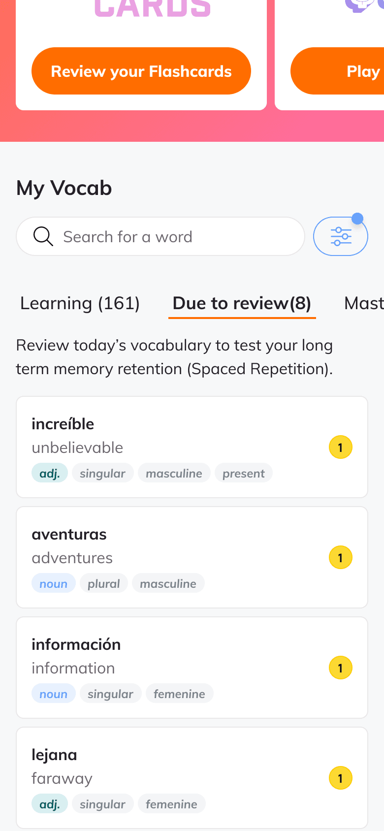
Reorganized the word list into a structured table with clear divisions for learning and mastered words (1). Updated the word box with additional information, such as definitions, part of speech, usage examples, and frequency counts (2). For mobile, I kept each word in a box like the previous version to simplify development efforts. The word box displays only the necessary minimum info, with additional details accessible via a tap on the word card.
My vocab table with additional information.
To improve user interaction, I added contextual swipe actions for mobile displayed on hover for desktop. Users can swipe or click to quickly hear the pronunciation, mark a word as known, or remove it from their My Vocab list, simplifying word management.
Actions menu opened on hover.
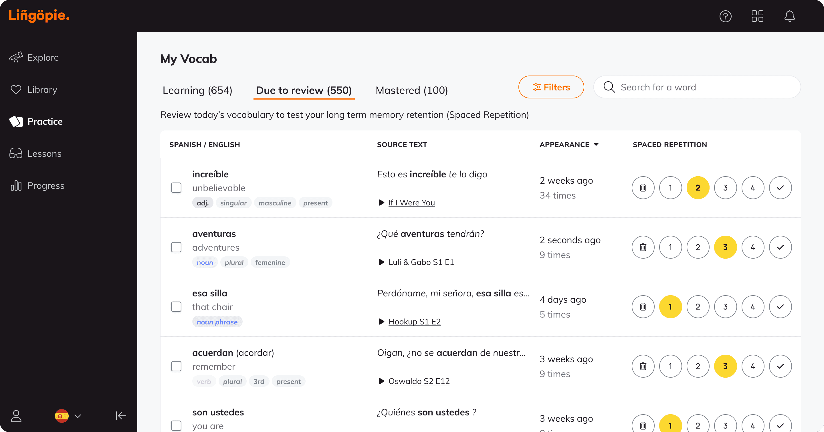
In a later iteration, I introduced spaced repetition indicators, a proven method in language learning. This addition provides users with visual feedback on their progress and reinforces their learning process, aligning with user expectations for effective vocabulary retention tools.
My vocab table with spaced repetition.
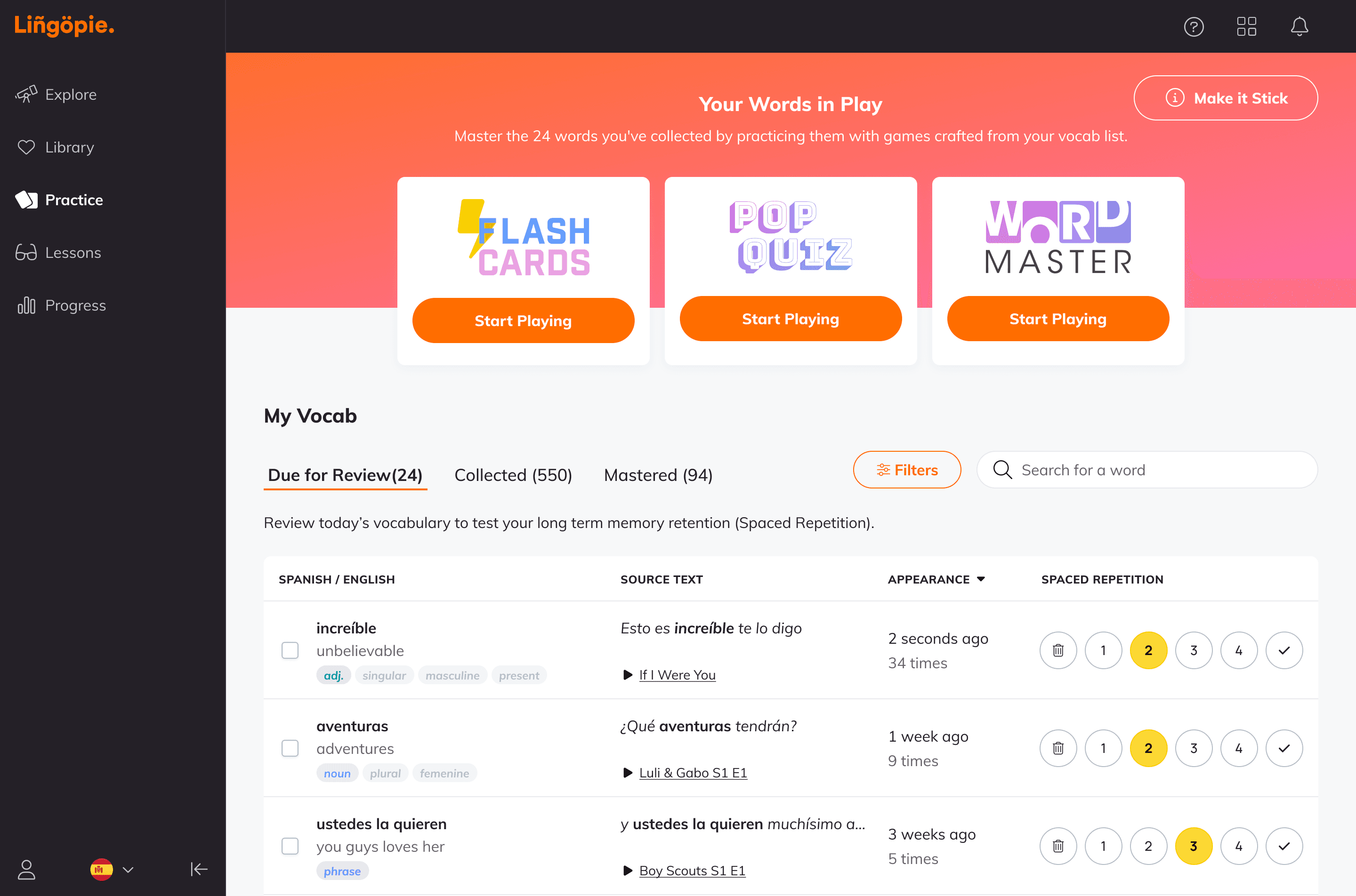
We used this opportunity to combine the games section and the My Vocab list into one unified page, making it clear that the words in the games are from the user’s list.
A single practice page that combines both games and the word list.
Filters, sorting, and search functionality
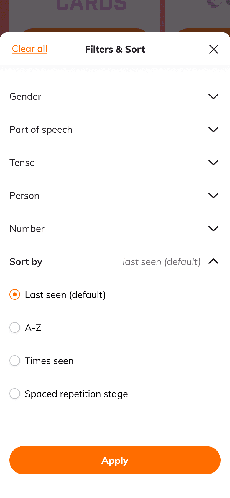
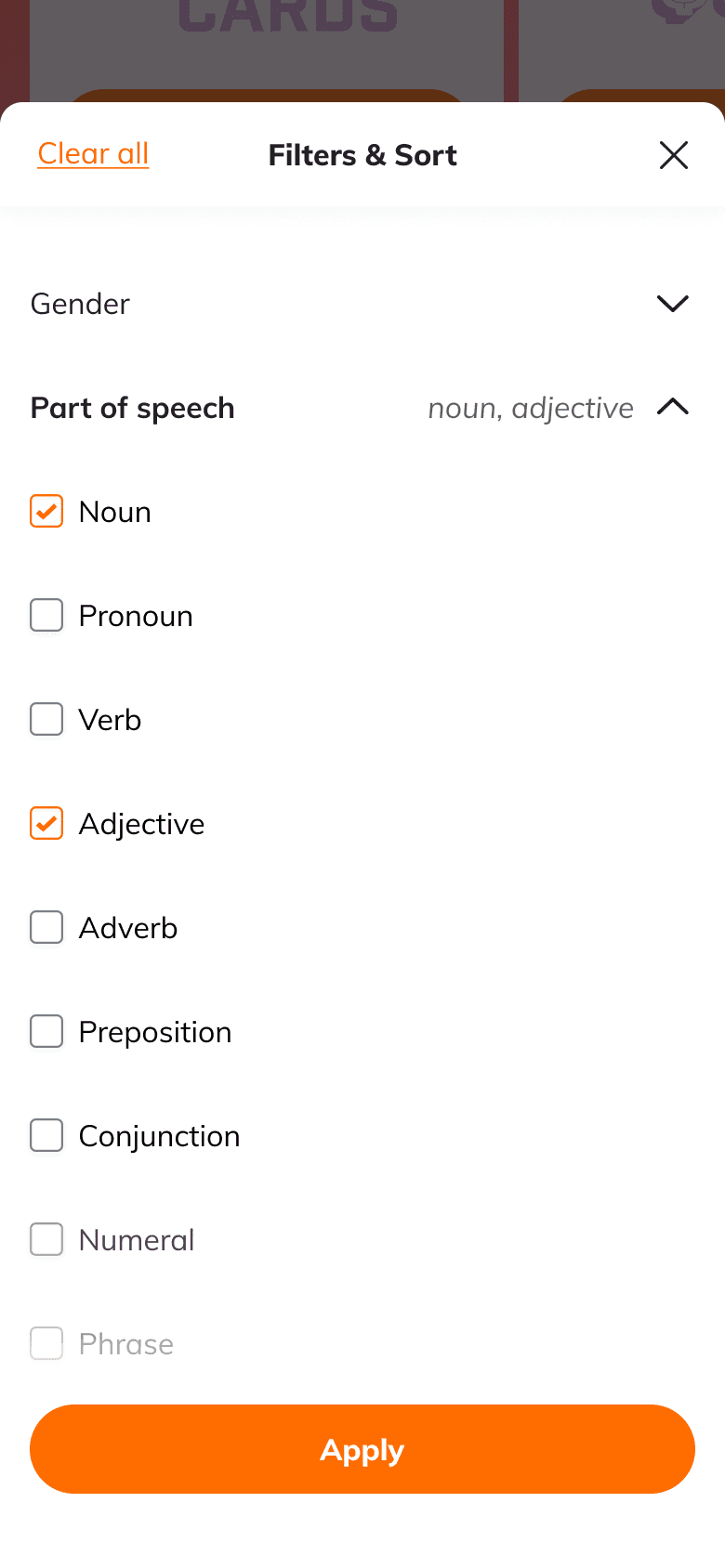
Introduced filters and sorting options, with the default view set to last seen, based on best practices for vocabulary lists. This helps users focus on their most recent interactions while allowing for easy categorization of words by different parameters (e.g., part of speech, gender).
Multi-filter functionality for My Vocab table.
Multi-select actions
I proposed the multi-select actions feature, inspired by similar lists I explored during the research phase. This allows users to manage multiple words at once, including marking as mastered or deleting words.
Practicing through multi-selection on mobile web.
Results
The My Vocab Transformation was a meaningful project for me, as it successfully addressed user pain points and transformed the vocabulary list into a more intuitive and engaging tool. By focusing on usability, contextual learning, and user-centric design, I was able to drive deeper engagement and enhance the overall learning experience for users.
+20%
my vocab interactions
+10%
MAU on the practice page conversion rate
+30%
filters feature adoption

Watch and learn
Bridging passive watching and active learning to cut churn.
User research • Micro-animation
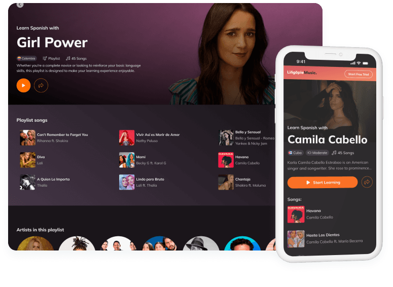
Lingopie Music
creating, rethinking, and integrating to drive growth.
Concept development • feature adoption
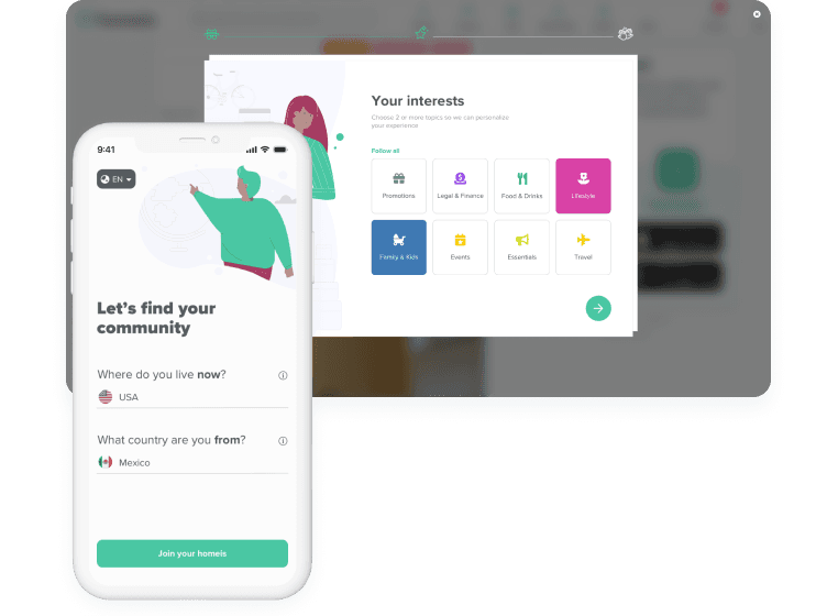
Onboarding flow
Boosting user engagement with an improved onboarding.
Conversion optimization • User flow
